John Lewis & Partners — Site optimisation
Lead UI Designer
2018–2019
Mobile header improvements
Background
Following the launch of John Lewis & Partners’ rebranded site in 2018 a drop in mobile menu usage was noted. A lot had changed in the header area compared to the previous version: new logo, buttons repositioned and icon labels removed.
Approach
After investigating usage stats and doing a market analysis we reviewed mobile handhold and reachability data. I designed a new set of label variants and introduced a persistent search bar. The site scrolling behaviour was also altered, hiding the header on scroll down allowing more space for content within the viewport.
Result
After several releases and tests we ended up with a new version of the mobile header. Click through rates and performed searches increased and therefore so did conversion. Customers could now easier find what they were looking for and buy it.
Product detail page enhancements
Background
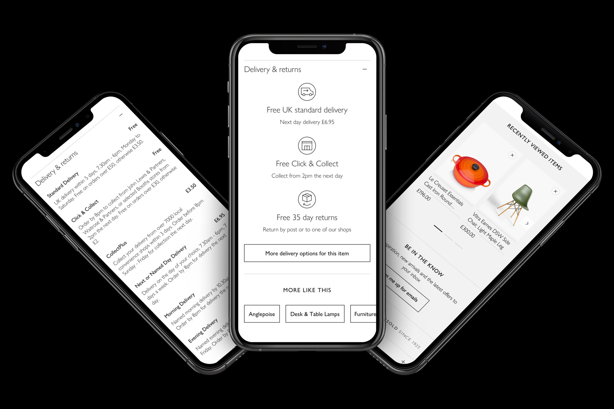
John Lewis & Partners’ generic product detail page wasn’t as helpful to customers as it could be, it needed reviewing. We started looking at stats, customer behaviour and page content to see where things could be improved.
Solution
Some areas identified for immediate focus were in-page navigation links, delivery information placement and copy, plus redesigning the ratings and reviews module, adding more helpful features.
Result
The changes made helped reduce bounce rate, added SEO benefits and kept customers engaged with related products. We also saw a positive impact on add to basket and conversion rates, adding value to the business.
“Malin is a very talented, artistic, and knowledgeable designer with an enviable ability to visualise new functionality. Her attention to detail is second-to-none, but she is very capable of making design compromises where design and technical feasibility diverge.”
— John Kavanagh, Senior Front-End Developer, John Lewis & Partners


